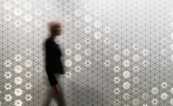
I’ve advocated in many forums that embedded lighting, particularly fusing patterns of light into architectural wall and ceiling surfaces, will become a major trend going forward, especially in office applications.
My theory is that in natural settings we humans are instinctively acclimated to dappled, organic patterns of light, and to be stuffed into offices with homogeneous, uniform and unchanging lighting just sucks the life out of us. A counterpoint I often reference is the example of laying in a hammock on a beautiful breezy day: No one complains that the light dappling through the leaves of the trees is “distracting” or produces too much “glare” — yet how pleasant and refreshing is it to read a book in such an environment?
Based on our prototypes at Philips Luminous Patterns, I see that there is clearly a range of dynamic animation that will prove acceptable for office environments. We built a stylish showroom at the High Tech Campus in Eindhoven (you can see a slick marketing video of the showroom on YouTube) and I’ve been spending many hours sitting in our design studio area, working next to our Luminous Patterns surfaces. I find my hypothesis indeed true – the animation is pleasantly invigorating. But I’m also seeing that there is a range of dynamic effect speed and intensity that is refreshing but not distracting, which is the key to winning widespread adoption of embedded lighting in office applications. Getting that balance just right will be the trick for designers who experiment in this area going forward.
Our design studio/conference room is flanked on one side by a large 5m long Luminous Patterns wall and topped with a Luminous Patterns ceiling, approximately 6 sq/m. For both the wall and the ceiling we used parametric design to create organic, stunningly beautiful patterns of light. We chose a white finish for both, medium-grey graphic printed overlays, monochromatic white light, and our 3D graphic shapes for the wall and 2D graphic shapes for the ceiling. Overall, the feeling is very contemporary, clean and bright, in a room with effectively no daylight.
We currently have the wall programmed with a dynamic pattern that I would characterize as “medium” intensity- approximately 2 ripples of darkness cross the wall every second, dimming from 100% on (the normal state of the light nodes) to 0% dark (the ripple) . The 3D shapes in silhouette plus the dynamic light effect is a mesmerizing combination that has attracted positive comments from nearly everyone visiting the showroom. The animation right now is set perfectly for a cocktail party. But from the perspective of office design, it is vibrant enough to be eye-catching. I would dare say that a significant portion of people will at first glance find the animation rate on the wall to be “distracting.” However, very quickly the animation on the wall becomes subconscious: occupants know it is active, they can see the activity from their peripheral vision, but they don’t find it distracting anymore. In fact, I personally enjoy it quite a bit when I’m working at my laptop: It gives my eyes a refreshing break when I lookup.

The ceiling is currently programmed with a less pronounced animation, using a subtle random pattern of dappled light with a much smaller dynamic range: Most of the light points remain on at full, with the dappled pattern dimming down to 70%. I think the majority of people won’t even notice the animation at first glance – not until they settle down in the space for a while and start to look around more purposefully, at which point it will probably be a delightful discovery for them. More importantly, I find that it is imperceptible to me from my peripheral vision (when I’m starting at my laptop); I don’t notice the dynamic animation unless I look straight up at it and consider for a second what I’m seeing. I’m sure the position on the ceiling, instead of at eye-level like the wall, further helps to mitigate the feeling that it is a distraction. I’m guessing we’re biologically programmed to notice the tiger in the bushes about to eat us, but no so much to look for predators from the sky.
Here is a video I shot with just my smartphone, with no fancy editing tricks:
The video doesn’t do the effect justice in real life – so don’t read too much into it. The smartphone camera doesn’t have a great dynamic range so everything looks blown-out, plus looking at the walls from a distance (like I shot this video) puts the entire surface and effect completely into view; sitting closer in, surrounded by the effect, feels very different. But it gives a sense of the real animation speeds I’m referring to.
There is clearly a range of animation variables that office designers and occupants will find “just right” for both ceilings and wall surfaces, but of course that depends wildly on the purpose of the space (lobby? conference? open work area?), the design of the finishes, access to natural light, etc.
For the next logical evolution, I believe we could add in more randomness to the programming (“parametric” or “algorithmic” programming), to make it feel even more natural, so people don’t notice the repetitive patterns of scripted shows. Or perhaps show some progression of change across the course of a day. Or maybe an extra animated pulsing every hour, like the chimes of a church bell?
I believe the day will come when entire office ceilings are lit with patterns of light, thousands of point sources that are low-glare, create a pleasant overall luminosity, and are programmed to help stimulate and refresh the occupants of the space without being an excessive distraction. Designers will quickly figure out the variables that dial-in these spaces to really prove effective.
