

I’m super impressed by a Samsung pop-up store in Frankfurt recently featured in Retail Design Blog. I find that it embodies many of the “embedded lighting” concepts I’ve been espousing as the future of lighting design.


First, let’s look at this project through the lens of Richard Kelly’s three elemental kinds of lighting:
- Ambient Luminescence: The general lighting is provided by lines of light that outline all the major edges of the space, wrapping completely around the volume of the space — ceiling to wall to floor. Although the lines of light are not overly bright themselves, the cumulative effect of all those linear meters of light strips is to fill the space with plenty of ambient light. The integrated lines of light make everything feel exceptionally bright and welcoming.
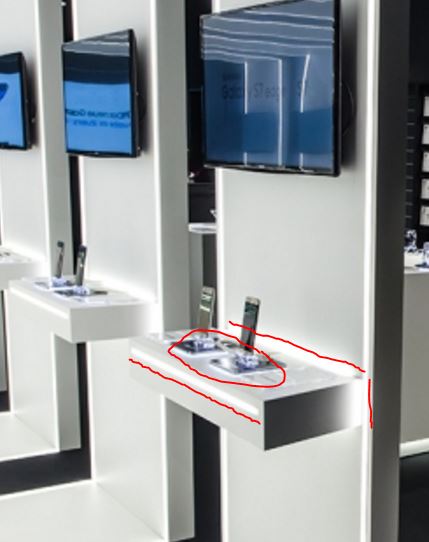
- Focal Glow: There is a clear focus on the shelves featuring the product, despite very limited use of traditional spot lighting. If you look closely at the shelves, there appears to be three integrated lighting elements that add this glow: a line of light on the front of the shelf; a halo effect where the shelf meets the wall; and perhaps a glowing plate under the merchandise (tough to really see what this is). Below is a quick sketch where I highlight the three pieces.
- Play of Brilliants: The “bling bling” in the space, in this case, is rightfully the product itself. Shiny Samsung TV monitors with glowing brand content; Samsung mobile devices, which themselves are sparkling light sources; the only architectural flourish is the row of glass display boxes running down the middle, which is also the only thing in the central space lit with spotlighting (probably because these are tanks of water, demonstrating the water resistance of the mobile phones).
Second, I want to address a couple specific concepts highlighted by this project:
- Bright edges: There is an incredible power to making architectural edges and corners luminous. Similar to this project I highlighted at Selfridges, nearly all of the architectural corners are lined with lines of light or have a concealed glowing halo effect, down by the “kick plate” detail. What is usually an ignored detail – literally the “dark corners” of architecture – here adds immensely to the perception of brightness and modernity.
- Not afraid of the dark: This project uses darkness and contrast (in this case, dark paint and floor finishes) around the perimeter of the store to make the merchandise and the central architectural feature feel even brighter, more “crisp” in appearance. There is some spotlighting around the perimeter, but it plays a secondary role to the glowing halos where the shelves meet the walls or the kick plate features on the podiums. The key aspect of this darkness is to give the eye some relief – the contrast helps the eye to focus and the brain to process what’s what in the room.
Kudos to marketing agency Cheil for the project. I can’t find any further information on who designed the lighting or the lighting gear used to realize the project.
