
Throughout the galleries of the Rijksmuseum, there is a noticeable perception of visual clarity in the lighting.
Two key factors, which are often not considered during the specification process, resulted in this success: Crisp shadows and the consistent, matched spectral output of all sources.
Crisp Shadows
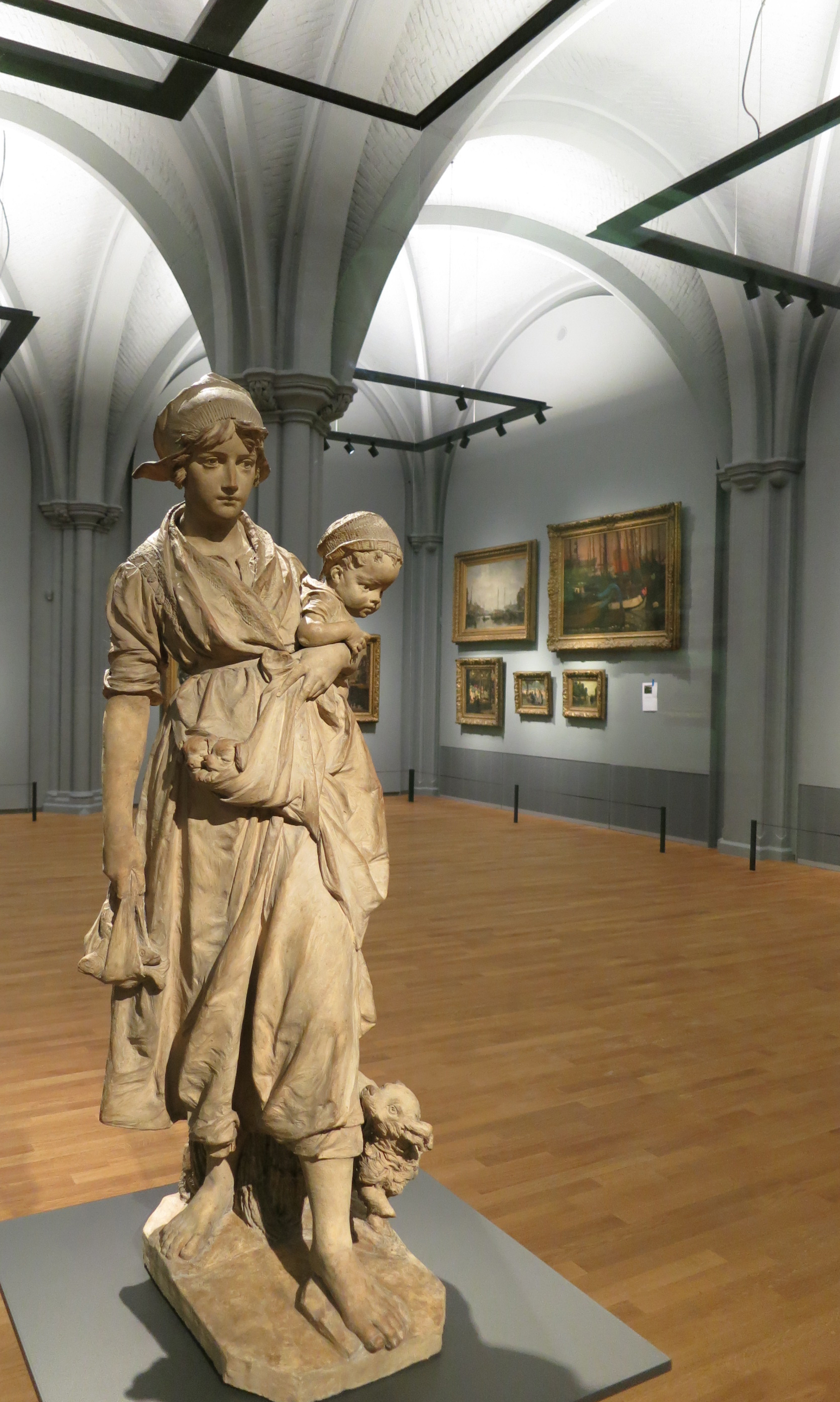
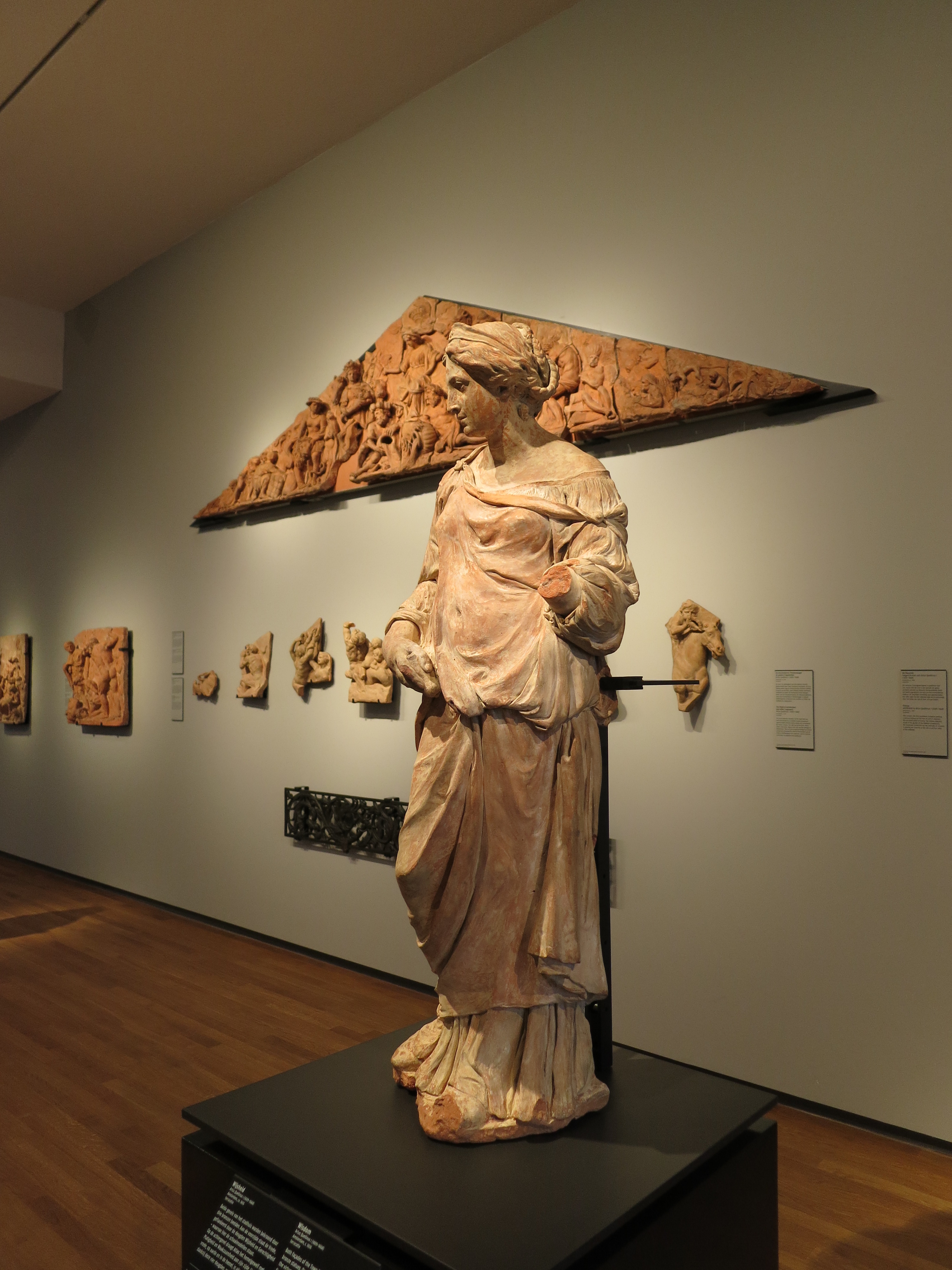
One of my personal goals in executing the design with LED technology was to create a fixture that produced crisp, single-edge shadow lines. Having spent many years using LED technology, I’ve come to hate the multiple-emitter design of virtually all early LED fixtures. When you hold an object in their beam of light, you get multiple overlapping shadows, causing garish effects and loss of visual definition. Plus the fixtures add visual clutter to what typically should be minimalist, modern architectural spaces. For interior point-source applications, a pure single-source emitter is the best approach…don’t cheat geometry because of mundane technological “constraints”.
While there are many high-quality, high-power LED arrays on the market (some pushing well beyond 10,000 lumens in the near future), most have diameters of 19mm or larger. We knew we needed an extremely tight beam (under 10°) in an extremely compact fixture (to match the architect’s vision), so we needed something much tighter in diameter but still hitting 1,000+ lumens with the utmost of color quality and consistency in color-over-angle. Luckily for us, Philips Lumileds had just released the 1100 lumen, 8mm diameter Luxeon S multi-chip package, and was putting into production a high-CRI version in time for the Rijks project. The Luxeon S allowed us to “stuff” the geometry of an 8° reflector optic into a tight 89mm diameter X 106mm long Philips StyliD track fixture.

The end result of using such a tiny, high power point source is a crisp, single shadow when the beam is obscured by an object. These “perfect shadows” more closely resemble shadows seen only in direct sunlight and vividly bring forth details in the artwork such as the textural relief of the oil paints, the detailed carving of the sculptures, or the gloss of a polished antiquity. In comparison to our perfectly Lambertian 8mm source, incandescent halogen sources have relatively large and non-symmetric filament windings, which lead to softer shadows, an overall “duller” appearance and artifacts/striations in the beam. Incandescent sources just can’t match the optical “perfection” of the best LED packages.

Consistency
Through a long process with the museum leadership, we selected 3000K LED sources for both the art lighting and the indirect uplighting. The spotlights on the art hit 93 CRI, the ceiling uplights 85 CRI. But in overall, since the two are both LEDs, they share similar spectral compositions and the light looks highly uniform throughout the gallery areas. Additionally, because LED sources do not color-shift when dimmed, all of the art pieces maintain exactly the same color temperature, even though the dimming levels vary widely (ranging from 10% to 100%) because of the variety of artifact sizes and illumination coverage requirements. Unlike halogen sources, which drastically shift color temperature when dimmed, the entire collection is displayed under perfectly matched illumination.
Additionally, lots of folks want to discuss binning issues, which has been one of the many “growing pains” for the LED industry. This is another tipping point demonstrated in this project: The entire project appears dead-on perfectly uniform. The issue of color uniformity was simply non-existent. All of the LEDs at the Rijks were supplied at ❤ SDCM; no “cherry picking” was performed nor needed. I believe our lighting design partners at BeersNielsen will agree: I dare anyone to find me any color variation in any of the galleries.

The Warmth of the Sun
If you ask people outside of the lighting industry what they want for white light, invariably they ask for “natural daylight”…and I think when they ask for this, they are imagining some brilliantly day-lit Caribbean beach, the warm sand radiating vividly and the turquoise water sparkling like diamonds. Unfortunately, most of the time lighting people immediately break that request into color temperature and rendition. Those are highly important, but equally so are the quality of the beam and the uniformity of the light.
The lighting at the Rijksmuseum looks great because the beams are super smooth yet the shadows are crisp, as if the objects are sitting under direct sunlight. And the color of the light is completely homogeneous, just like the mid-day sun. There is no jarring color or rendition contrast from, for example, the combination of halogen spotlighting and fluorescent uplighting.
In the next post I will discuss the Zhaga compliant Philips Fortimo modules we used…
